A navy-and-gold brand identity for Aralias — the members' club at the heart of DLF's flagship luxury residences in Gurugram. One infinity-loop wordmark, drawn once and carried through every sub-brand, sign, menu, package and uniform on the property.
The Aralias is one of DLF's most exclusive addresses, and its members' club spans a small city of amenities — dining rooms and a bar, a spa, a gym and salon, courts for tennis and squash, a kids' club. The brief was a single identity supple enough to badge all of them without ever looking like a different place.
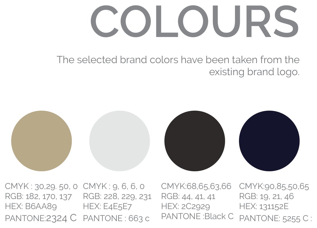
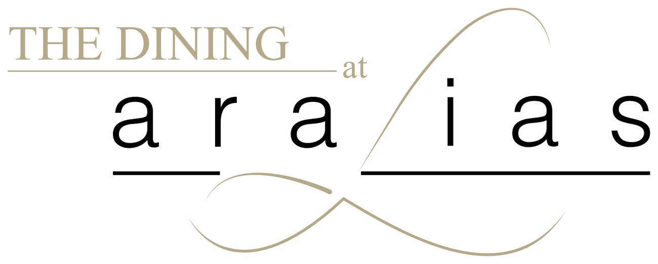
The answer is one drawn wordmark — "aralias," its letters tied together by a long, continuous infinity loop — rendered in a restrained palette of deep navy, gold, stone and cream. Each amenity becomes a quiet sub-brand off the same line.
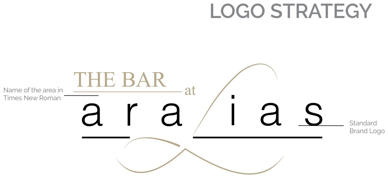
A single line that never lifts off the page.
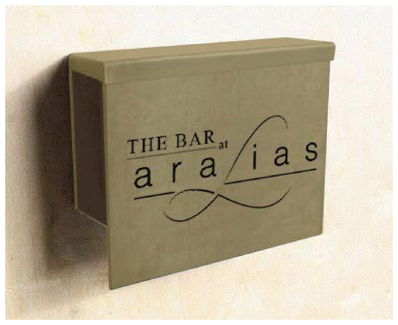
The heart of the identity is the "aralias" wordmark — lowercase, wide-set, with a hand-drawn loop that runs beneath the letters and ties back on itself like a continuous ribbon. It reads as calm and confident rather than loud, and it scales from an embossed coaster to a metre-wide sign without losing its line. Every sub-brand — The Bar, The Dining, The Spa, The Gym, the kids' club — simply sits a small Times-set label above the same mark.
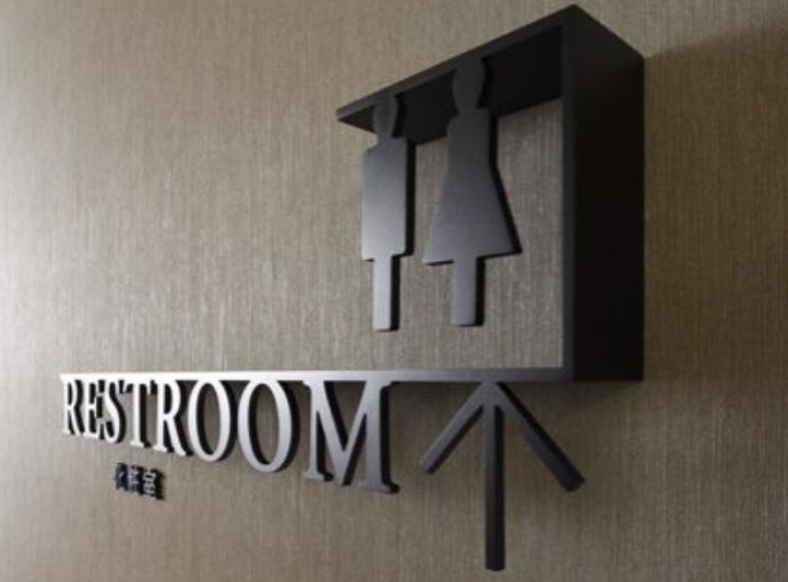
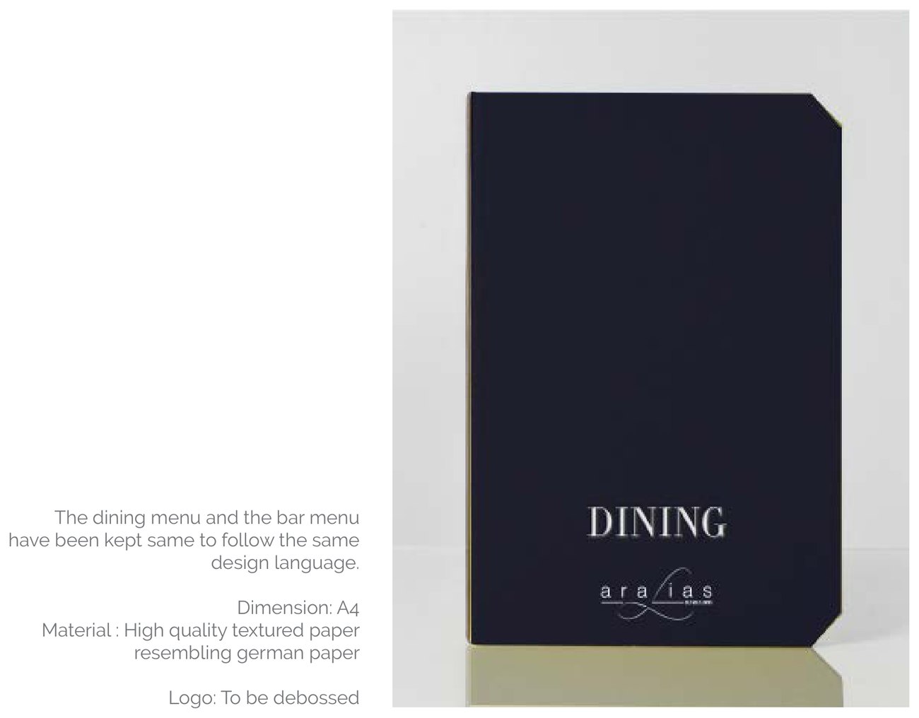
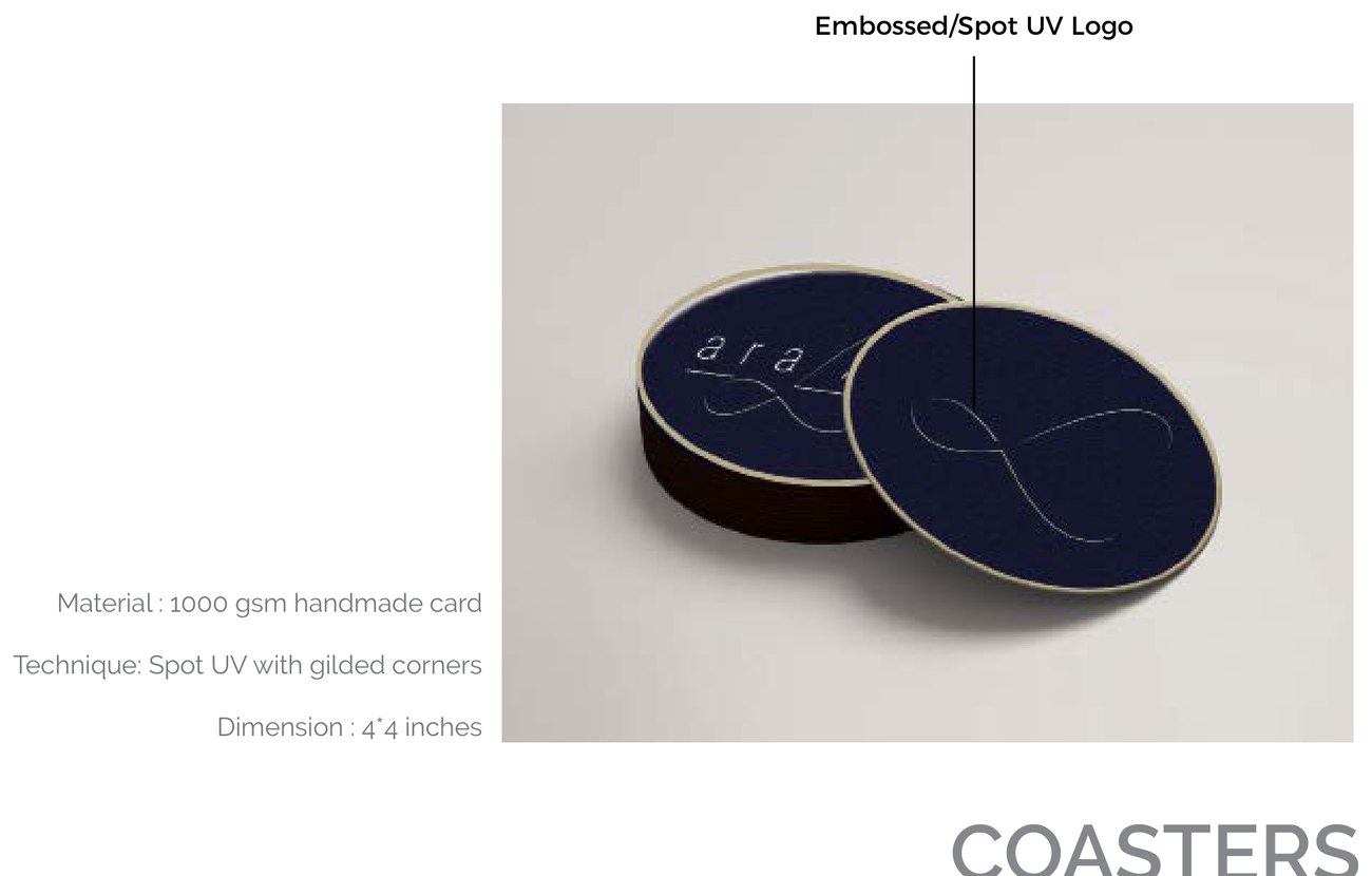
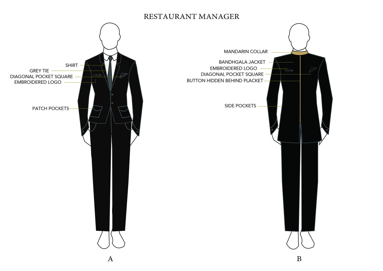
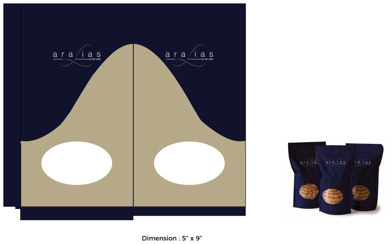
From there the system spreads. Laser-cut signage carries the loop along corridors and onto backlit panels; menus are debossed on textured stock bound like petite notebooks; coasters arrive in 1000-gsm navy with spot-UV gilding; staff wear tailored bandhgala. A full patisserie and packaging range — cookie, chocolate, macaroon and bread bags, boxes and folders — keeps the same two colours and the same single line, so a chocolate handed over at the gym belongs to the same club as the bar downstairs.
Luxury here is in what's withheld. Two principal colours, one typeface family, one drawn mark, and a lot of quiet space. Nothing shouts; everything matches. The result is an identity that feels less like branding and more like the manners of the place.