A strategic naming and identity exploration for a hospitality group's rebrand. From a shortlist of candidate names to three fully worked routes — Hotel Craft, Hotel Kraft, and a location-pin "Point Hospitality" — this is the upstream half of branding: deciding what the thing is even called.
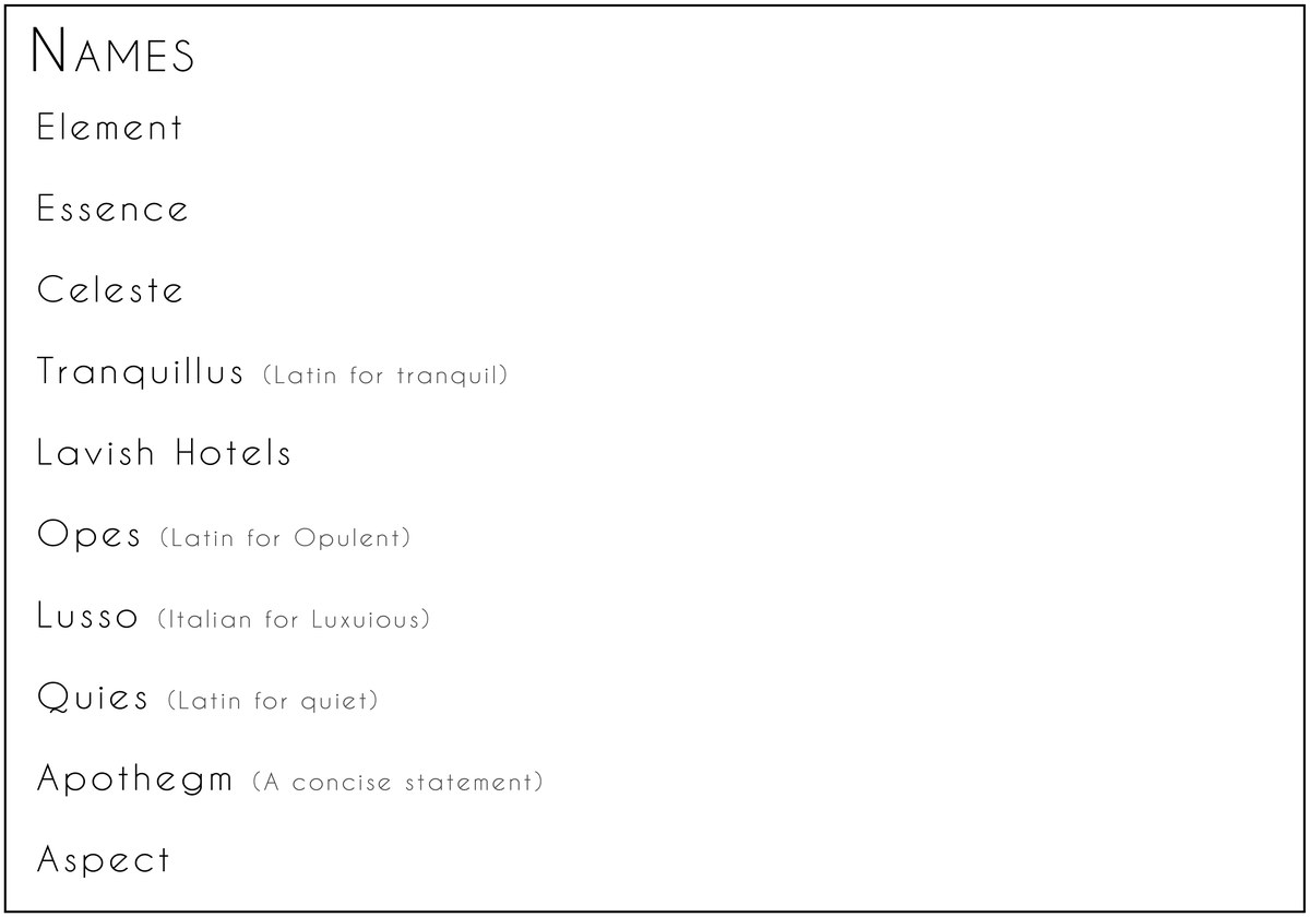
A hospitality group came to the rebrand without a settled name, so the work started where branding really begins — with language. The first deliverable was a shortlist of candidate names, each with a rationale: Element, Essence, Celeste, Tranquillus, Lusso, Quies, Aspect — words chosen for what they'd let the brand become.
From that list, three names were taken all the way to identity, so the client could judge each not as a word but as a working mark.
The same idea, two spellings.
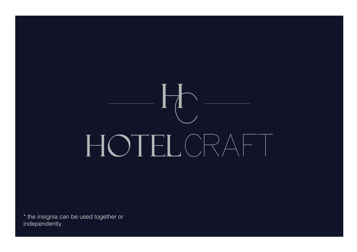
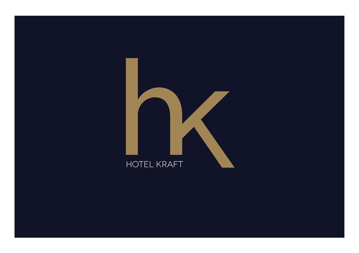
"Hotel Craft" leans on the language of making — hospitality as a skill, a craft — locked up with a clean "HC" insignia that can run with the words or stand alone. "Hotel Kraft" compresses the same thought into a single gold "hk" monogram, a more graphic, exportable mark for a group that might one day badge many properties.
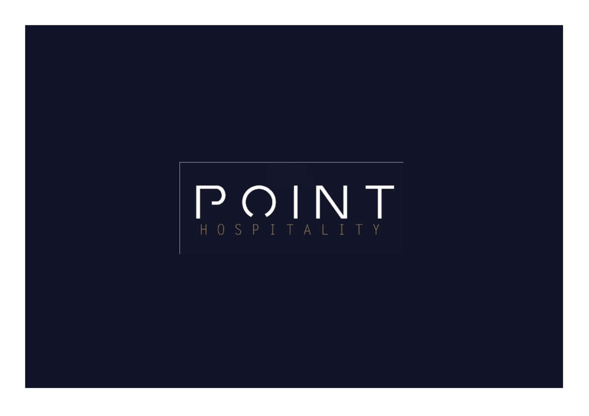
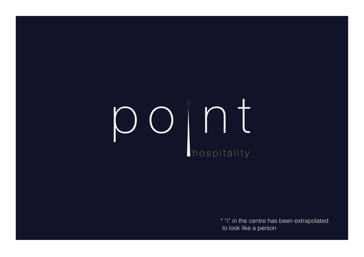
The route with the most wit is "Point Hospitality." The dot of the "i" is extrapolated into a map pin — the universal sign for a place — and, looked at again, into a standing figure: a person, a guest. One small move makes the wordmark carry the whole promise of the brand — being exactly where you should be, looked after. "On point," literally drawn.