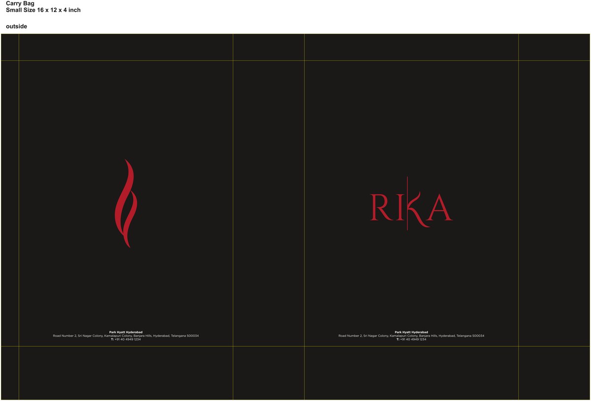
A restaurant identity for Rika at the Park Hyatt Hyderabad, built on a single element: a red flame set against black, with a slash of crimson. One mark, used sparingly, doing all the work.
Rika needed an identity with heat but not noise — a fine-dining room where the mood is dark, intimate and a little theatrical. The whole system reduces to a single drawn flame in red, set against black, with crimson as the one accent allowed to flare.
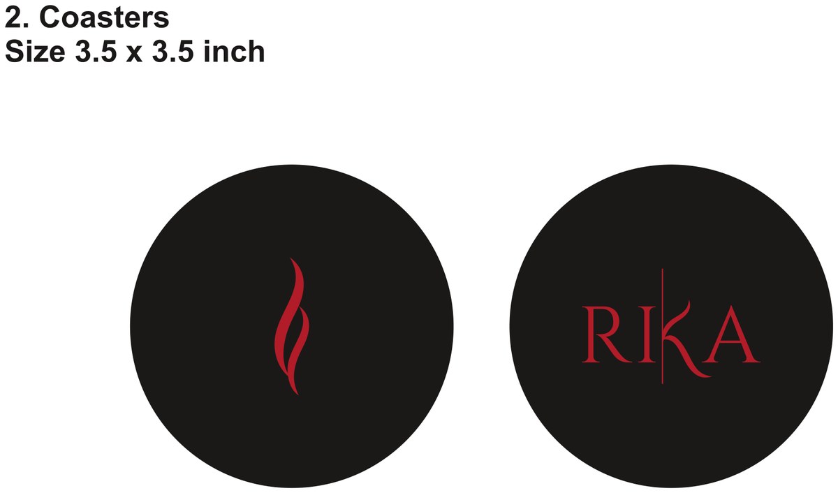
Restraint is the point. The flame is used once per surface — laser-cut into a card, centred on a coaster, paired with a quiet "RIKA" — so it always reads as a signature rather than a pattern.

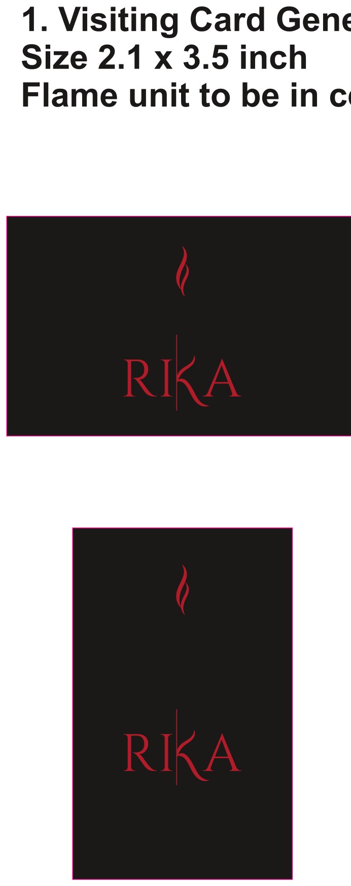
Drawn once, cut into everything.
The flame is a single confident brush-form — two licks of red that read instantly as fire without illustration or cliché. Spec'd as a laser-cut on the business cards and embossed on the coasters, it becomes a tactile detail, not just a printed logo. It's the kind of mark that works because it's never explained.
The palette is deliberately two notes: a deep matte black for most of the system, and a single crimson that arrives on the tableware and the flame itself. Holding the colour back everywhere else is what gives the red its charge when it finally lands on the table.